From idea to reality
Every branding project begins long before the design of a logo. It begins with an idea, an intention, and a set of concepts capable of giving meaning to a brand. In developing NODO 800, the starting point was connectivity: understanding space as a meeting place that links people, experiences, and places. Based on this premise, we defined three fundamental pillars to build its identity: connection, minimalism, and agility. It wasn’t just about representing a lodging facility, but about developing a visual language that conveyed its essence and its relationship with the urban environment. With the concepts defined, the process of graphic exploration began. The search focused on a geometric visual system, where circles, rings, and simple shapes would convey the idea of connection and continuity. Each element had to serve a purpose and reflect a conceptual intent. At this stage, the challenge was to strike a balance between simplicity and distinctiveness: to reduce the graphic elements to their most essential form without losing their ability to be identified and recognized.
In developing NODO, we started with a central idea: connectivity. A space designed to connect people, experiences, and places. Based on that concept, we defined three pillars to build its identity: connection, minimalism, and agility.
Nodo
https://www.instagram.com/nodo_800Every letter, a connection
Typography then became one of the central elements of the design. We explored a design based on sans-serif typefaces with rounded geometry, uniform strokes, and consistent curves. But the process went beyond simply choosing a typeface family: the letters began to relate to one another, overlapping and interlocking to create an integrated visual structure. In this way, “connection” ceased to be merely the concept that inspired the brand and became an inherent characteristic of its graphic design.
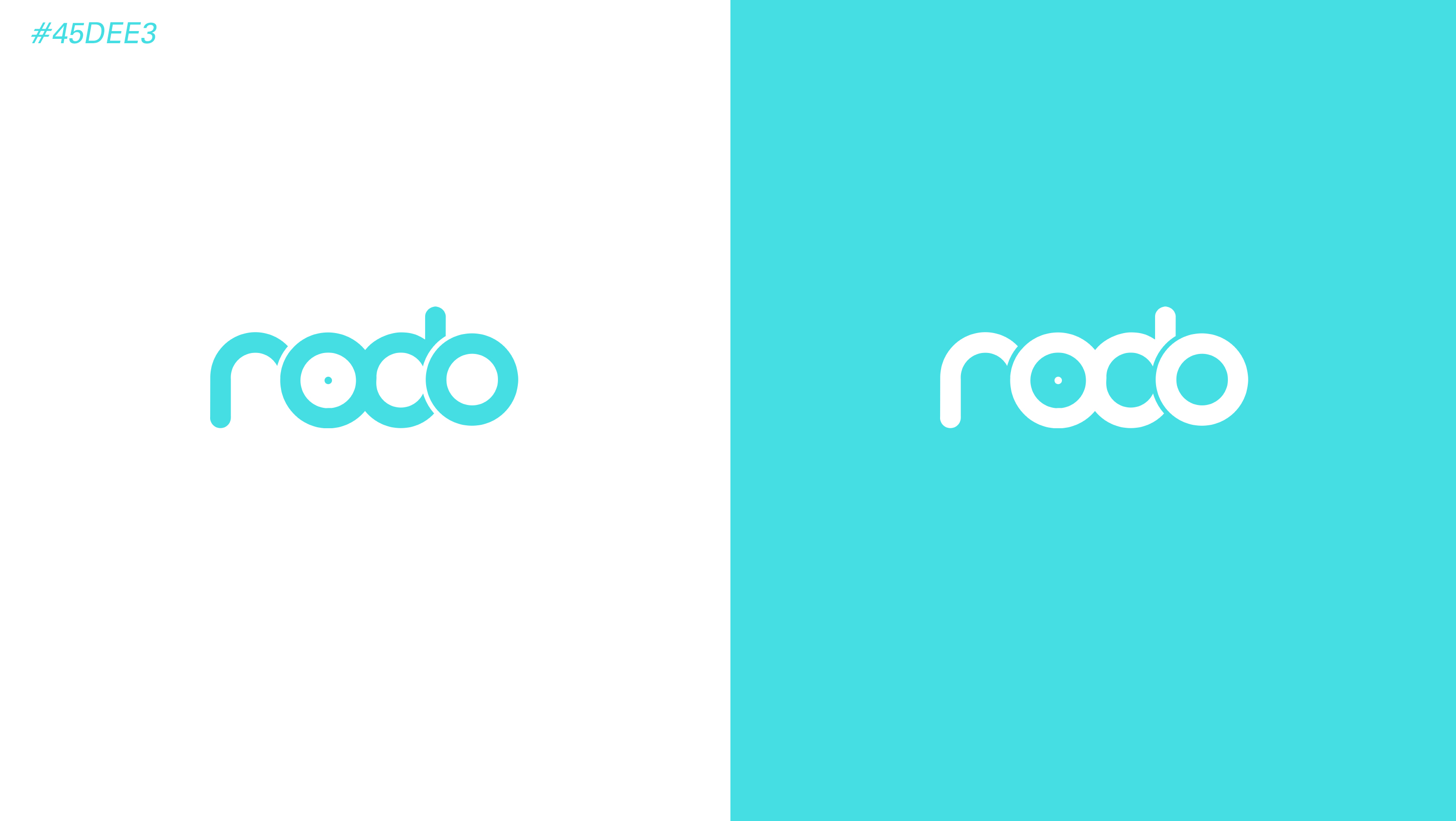
The result is a compact, minimalist, and dynamic identity, in which each component forms part of a single system. The relationship between the letters, the continuity of their strokes, and the synthesis of their forms make it possible to build a recognizable brand with personality and visual coherence. The NODO 800 identity does not seek to communicate its attributes through decorative elements, but rather to incorporate them into its own structure. That is precisely where the concept gains value: when it ceases to be mere rhetoric and becomes a design solution.
From Concept to Reality
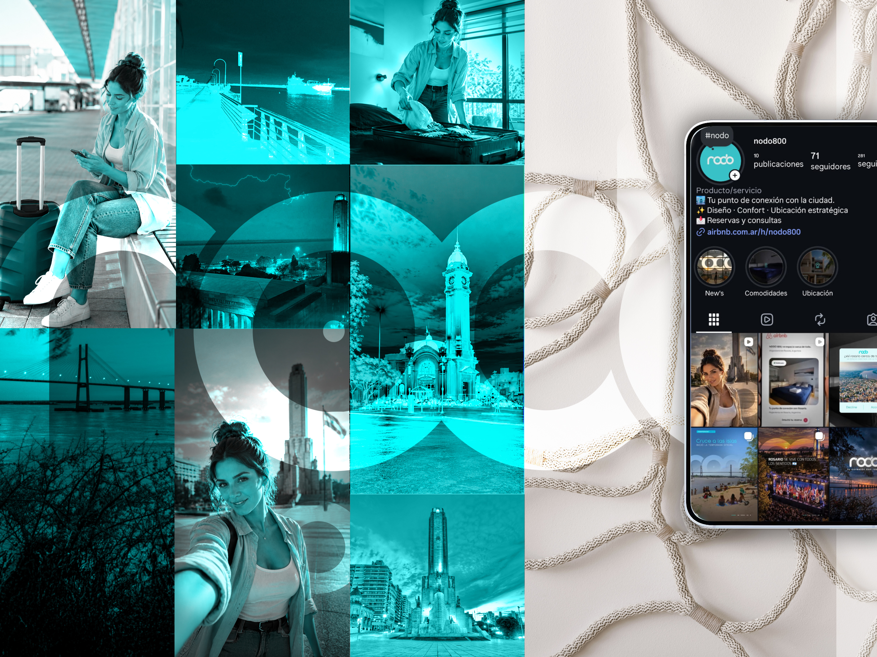
This project reflects a fundamental premise of our branding work: a strong brand does not begin with how we want it to look, but with what we need it to communicate. Starting with clear concepts allows us to make well-founded design decisions, build coherent visual systems, and develop identities that transcend graphic trends. Because designing a brand isn’t just about creating an attractive form; it’s about finding the most precise way to transform an idea into a meaningful visual identity.