Fitmetics: The future of fitness cosmetics.
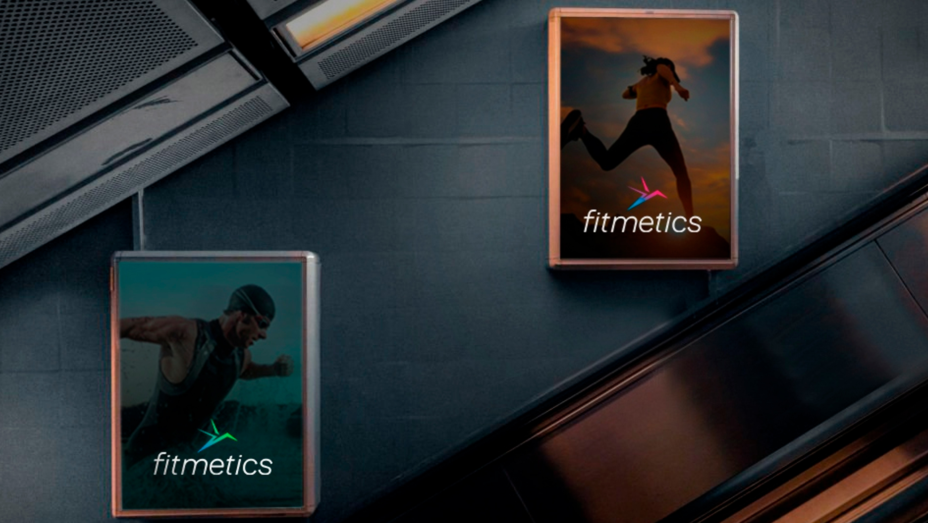
At the core of the brand lies a philosophy that integrates fitness values with everyday beauty rituals. This is reflected in every element of its visual identity, starting with its isotype, a simplified representation of a hummingbird. This symbol was selected for its ability to evoke dynamism and agility, characteristics that define both fitness and the brand.
The name Fitmetics emerges as a meticulous result of the brand creation, representing the fusion between fitness and cosmetics. This project was conceived through a design process focused on knowing key aspects for the development of its visual identity and its applications in all aspects of the brand.
https://estudiojpg.com/FITMETICS.pdf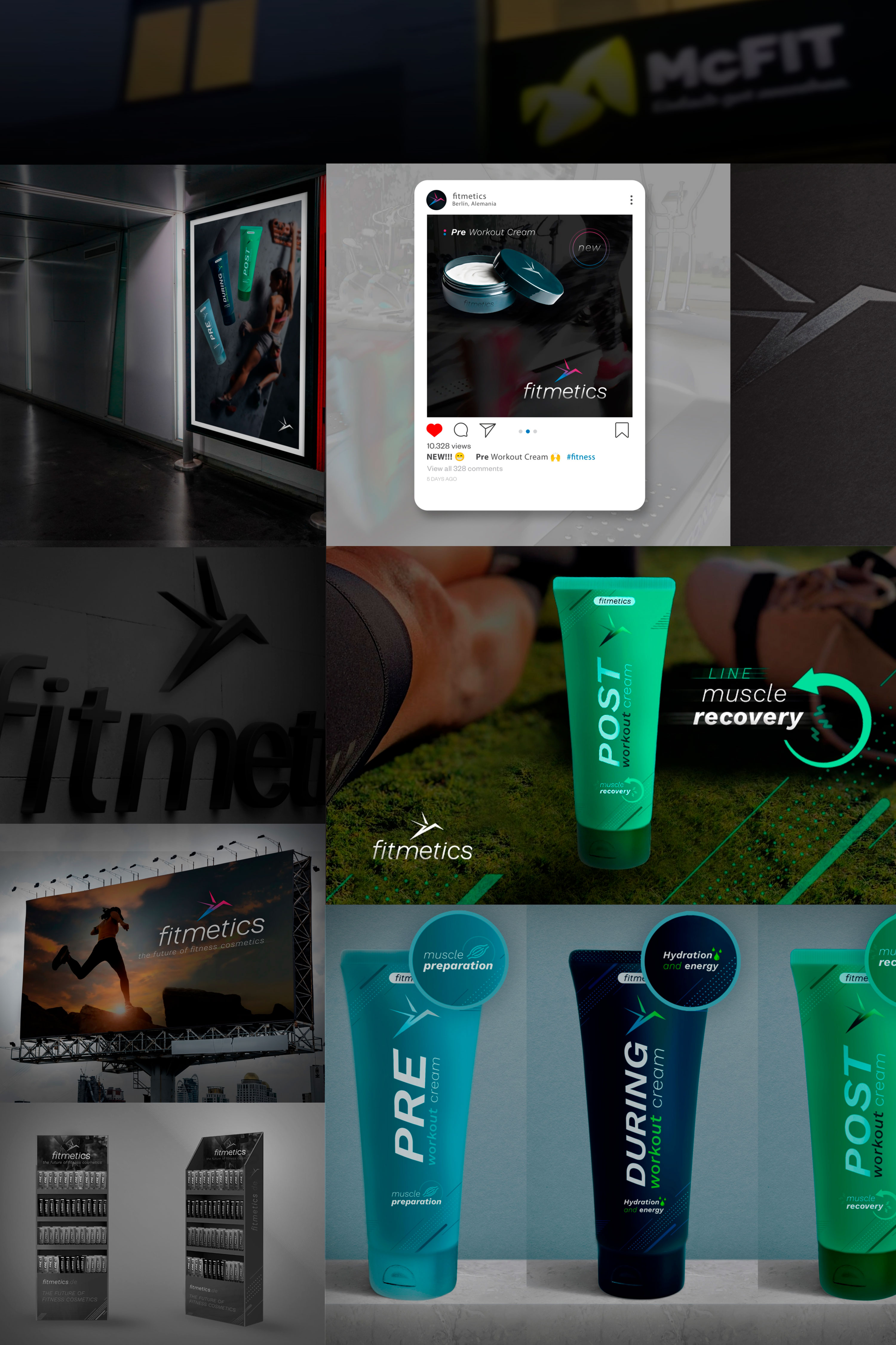
Sketched...
For the logo design, we based our work on the use of the sans serif typeface “Work Sans”, on which we made adjustments to its original layout, applying more simplicity and generating a slight inclination in order to convey greater dynamism and combination with its isotype. This work ensures an important visual coherence in all its media, from social networks to street signage. This process of alignment and refinement guarantees a solid and recognizable visual identity for the brand in all its points of contact with customers.
The brand application extends to Fitmetics' entire product line. From its moisturizers to its lipsticks, all Fitmetics products reflect the unique fusion of fitness and beauty, reinforcing the brand's identity in the marketplace.
In short…
Fitmetics' design is the result of a careful and deliberate brand-building process designed to represent the convergence between fitness and cosmetics. From its initial design to its implementation across all aspects of the business, a celebration of the synergy between fitness and personal care.