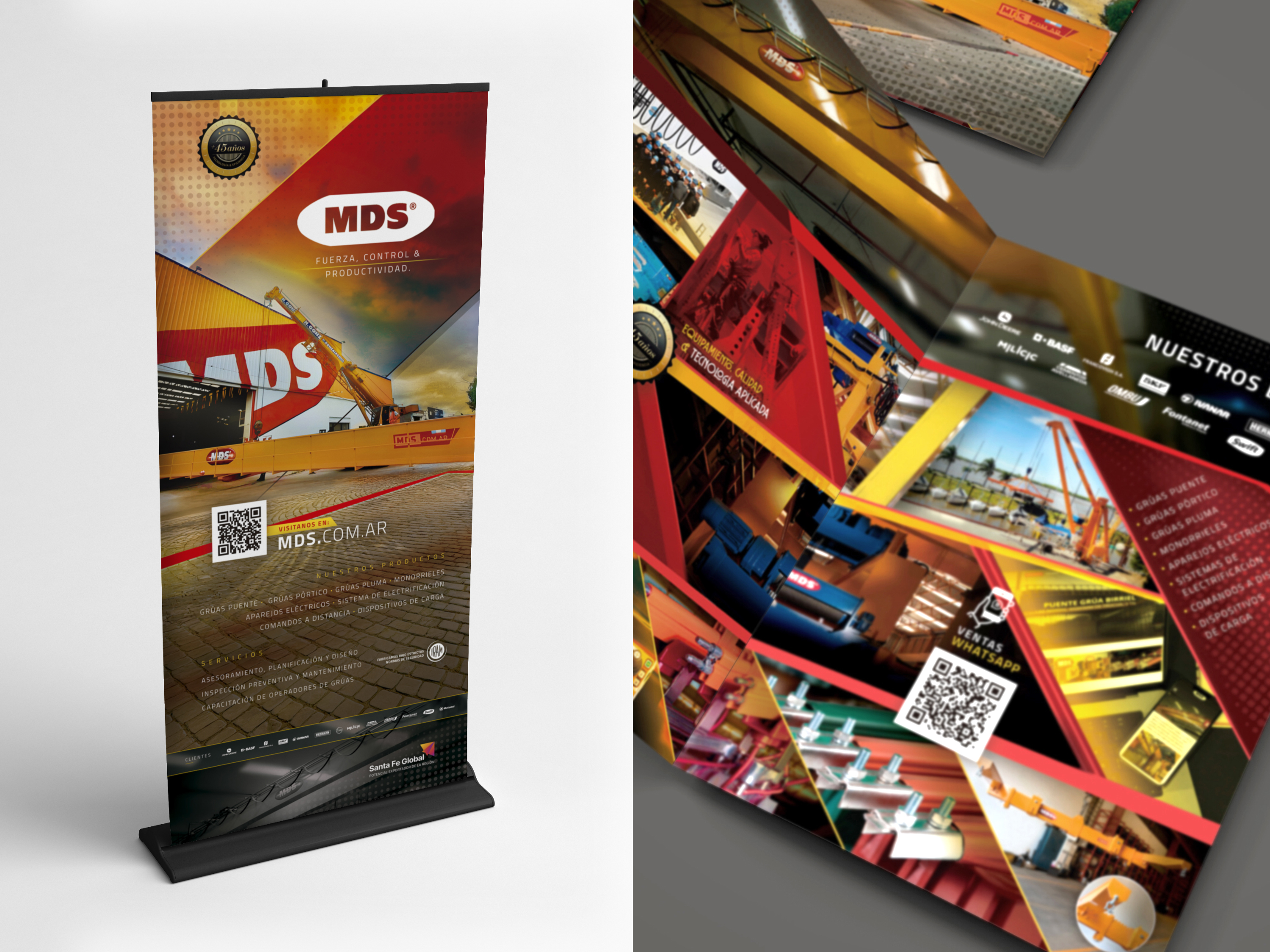
Brochure and totem advertising design
In April, we accompanied MDS in its participation in an important industrial fair in Chile, developing a comprehensive visual communication system specially designed to enhance its brand presence and facilitate the marketing of its products abroad. The challenge was to represent with impact the strength, precision and productivity that characterizes the company, within a competitive environment with a high flow of visitors.
For this purpose, we designed a diptych brochure in A4 format that summarizes in a clear and hierarchical way the main services and products offered by the brand. The content was organized in a structured image system grid, with real images of works performed, allowing to visualize the scope and robustness of the different models of overhead cranes. The choice of a high visual contrast aesthetics not only reinforced the industrial identity of the brand, but also facilitated an agile reading in contexts of dynamic circulation such as a trade fair.
Metalúrgica del Sur SRL
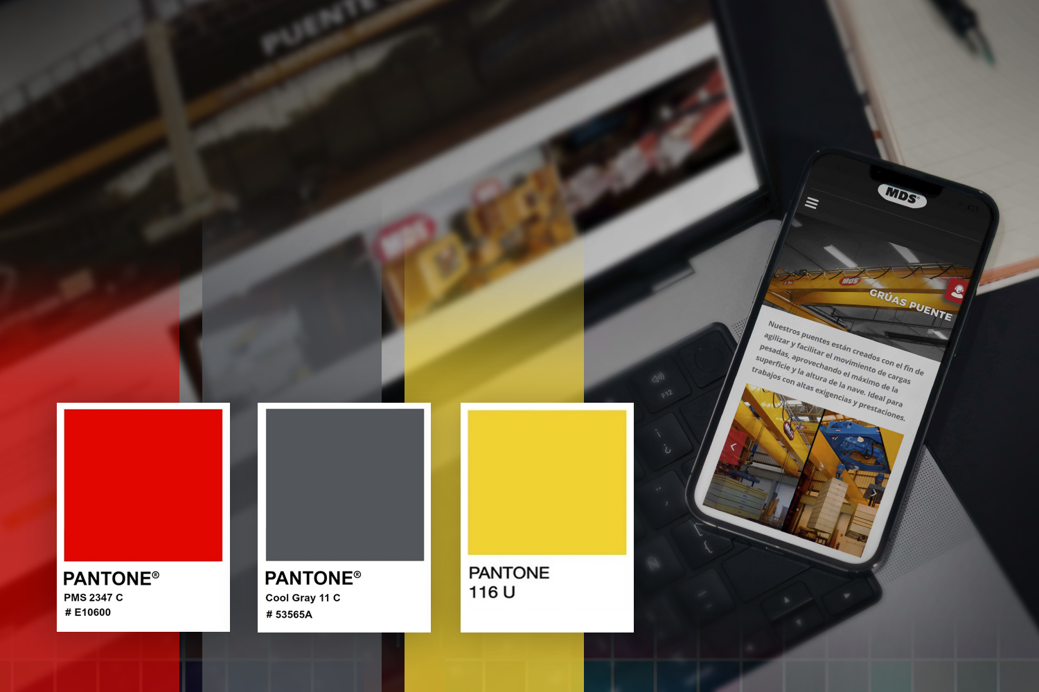
The importance of color...
The chromatic palette remained faithful to the corporate colors -mainly red, gray and yellow- which we applied strategically to generate brand recall and coherence in each graphic support. This selection, together with a clear and robust typography, allowed us to highlight the key concepts of MDS's value proposition: strength, control and productivity.
In addition to the brochure, we developed an advertising totem for the stand, designed as a high-impact visual identifier. This totem served as the focal point of the space, capturing the attention of the attendees from a distance. Its design responded to a minimalist aesthetic, but with a strong imprint, consistent with the visual identity of MDS and with the aim of standing out among the exhibition offer.
System design...
Both media complemented each other to clearly and professionally convey the MDS proposal, helping the sales team to generate new strategic links during the three-day event. This design intervention not only raised the brand presence, but also worked as a powerful sales tool. From Estudio JPG we celebrate once again to be able to accompany Argentine industrial companies that bet to project themselves internationally with a clear, solid and coherent communication with their values.