Packaging & Photography


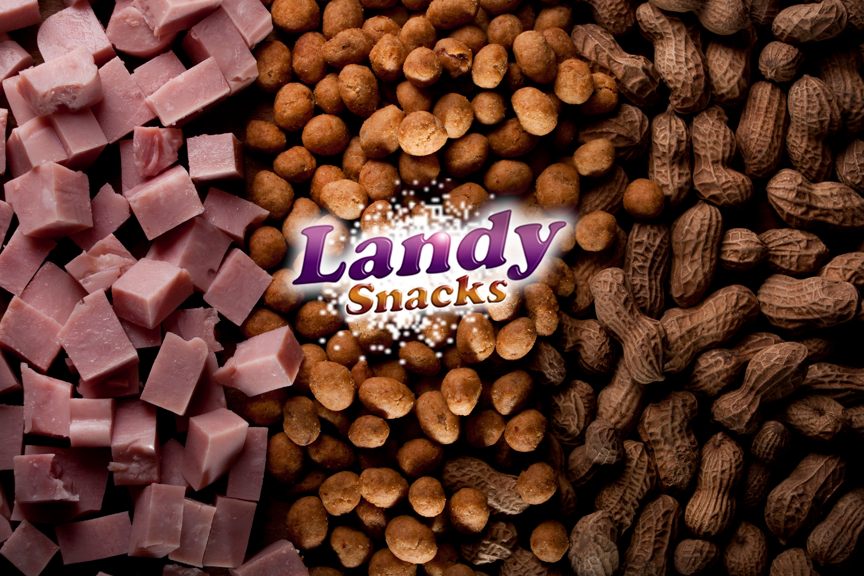
We started the project with an extensive briefing process, where we conducted an in-depth analysis of the company and the market where it operates, including its competitors, the aesthetic paradigm and the target audience. Once the information was collected and analyzed, we developed a visual system that seeks to highlight the flavor and quality of the products by playing with strong contrasts.

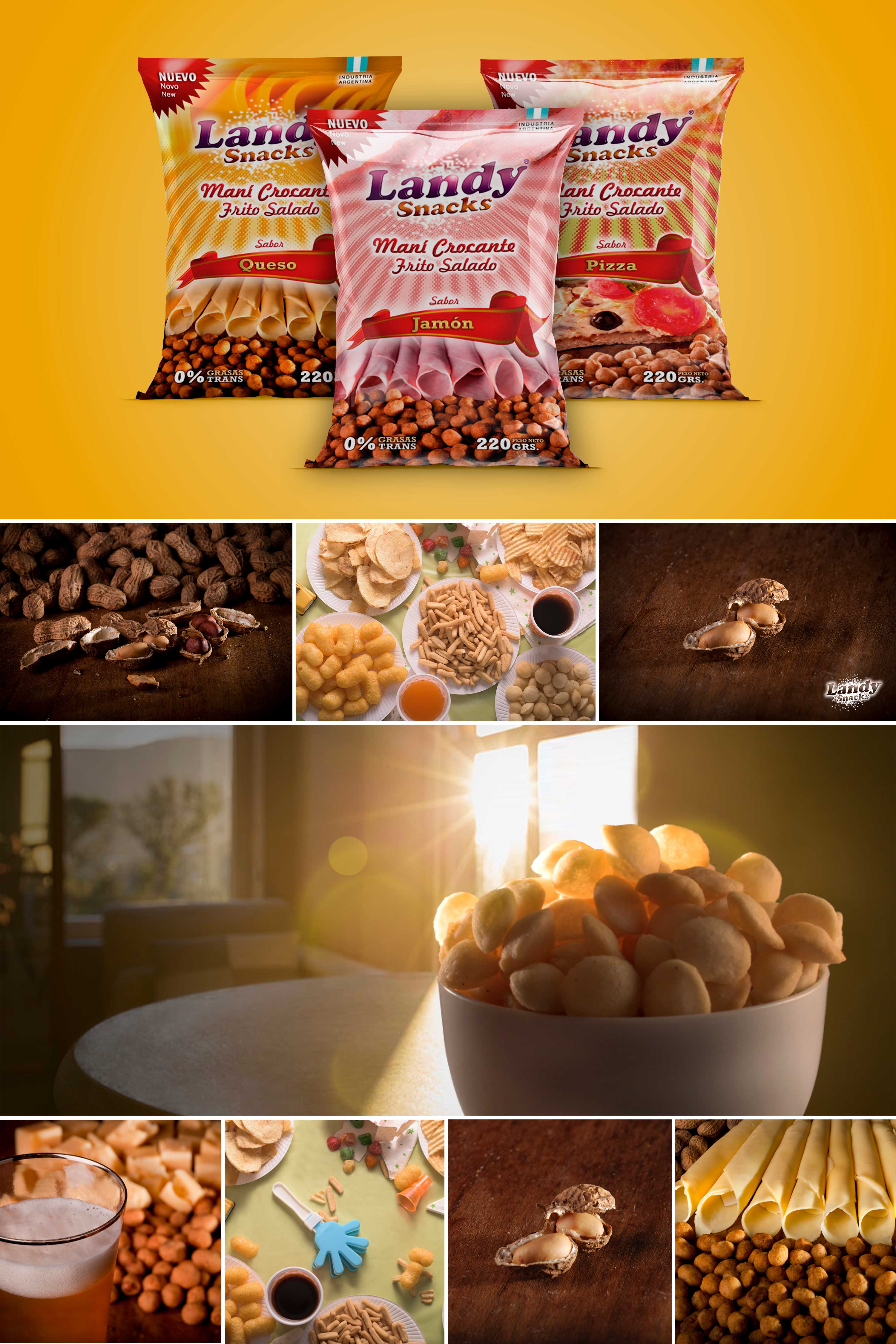
We designed a design system applied in three packs for different flavors (cheese, ham and pizza) which lay the foundations for adding future flavors. The main objectives of these were to generate a system strong enough to differentiate the brand from other possible competitors, without producing confusion between each variety of the same line.

We used photography and the chromatic range as the main differentiating resource, thus achieving a semi-open system that allows the extension to new varieties and standing out against competitors.