Ultralight S.A.

We started our work with the design of the company's brand image. In order to highlight the naming, we sketched different ways to represent it iconically with simple and effective visual elements for its future applications. From the combination of the letters "U" and "L" synthesized, we achieved an elegant and simple isotype that transmits the concept of expansion and technology.

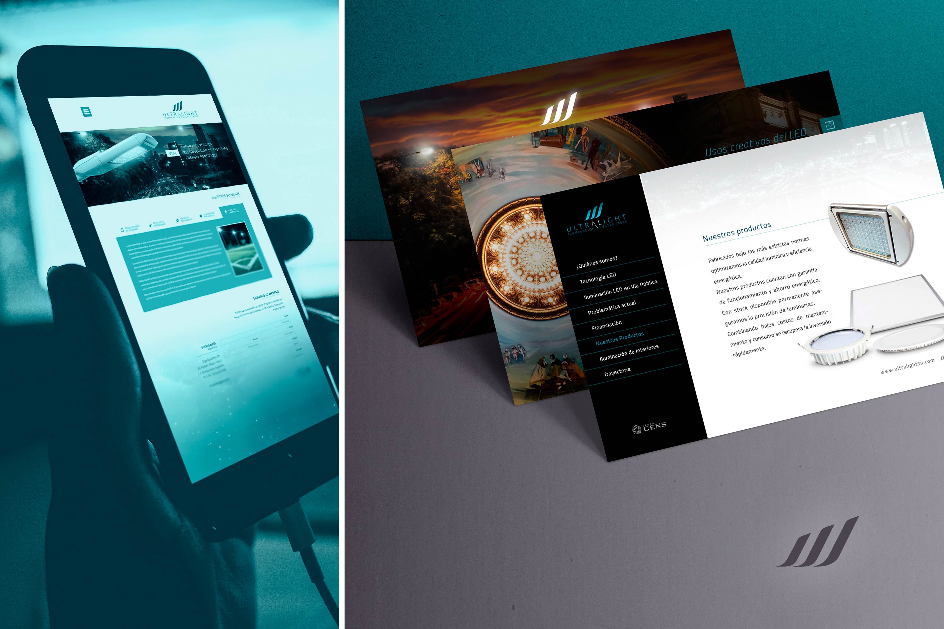
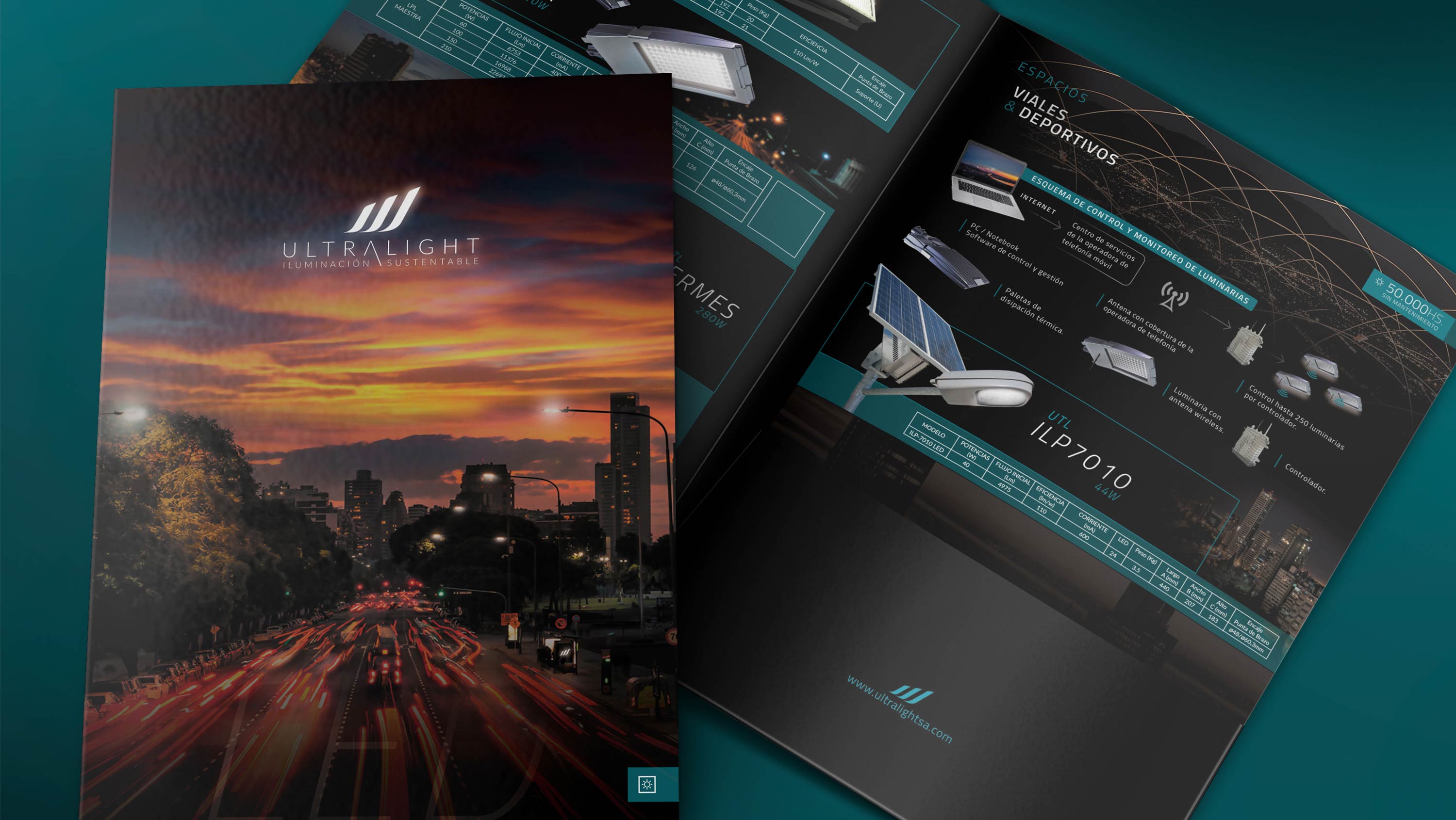
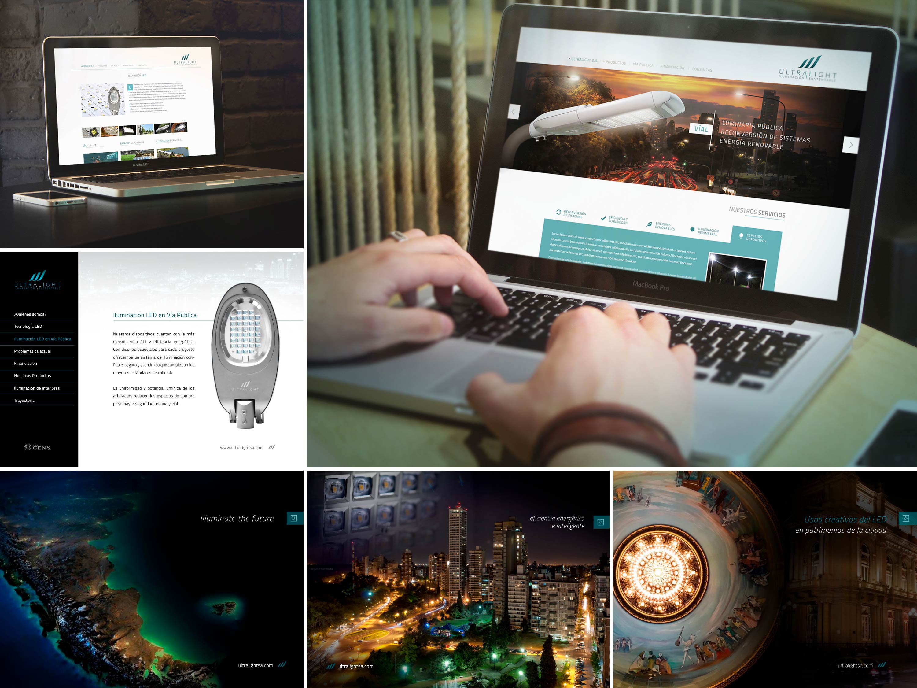
Once the brand image was defined, we continued with the design of different applications such as a product brochure, website, advertising merchandising, stationery, brochures, among other elements.

We also designed a website where the company, its products and services are presented, as part of a brand launching to the market.