Prolife · Bebida Provitamínica


Packaging
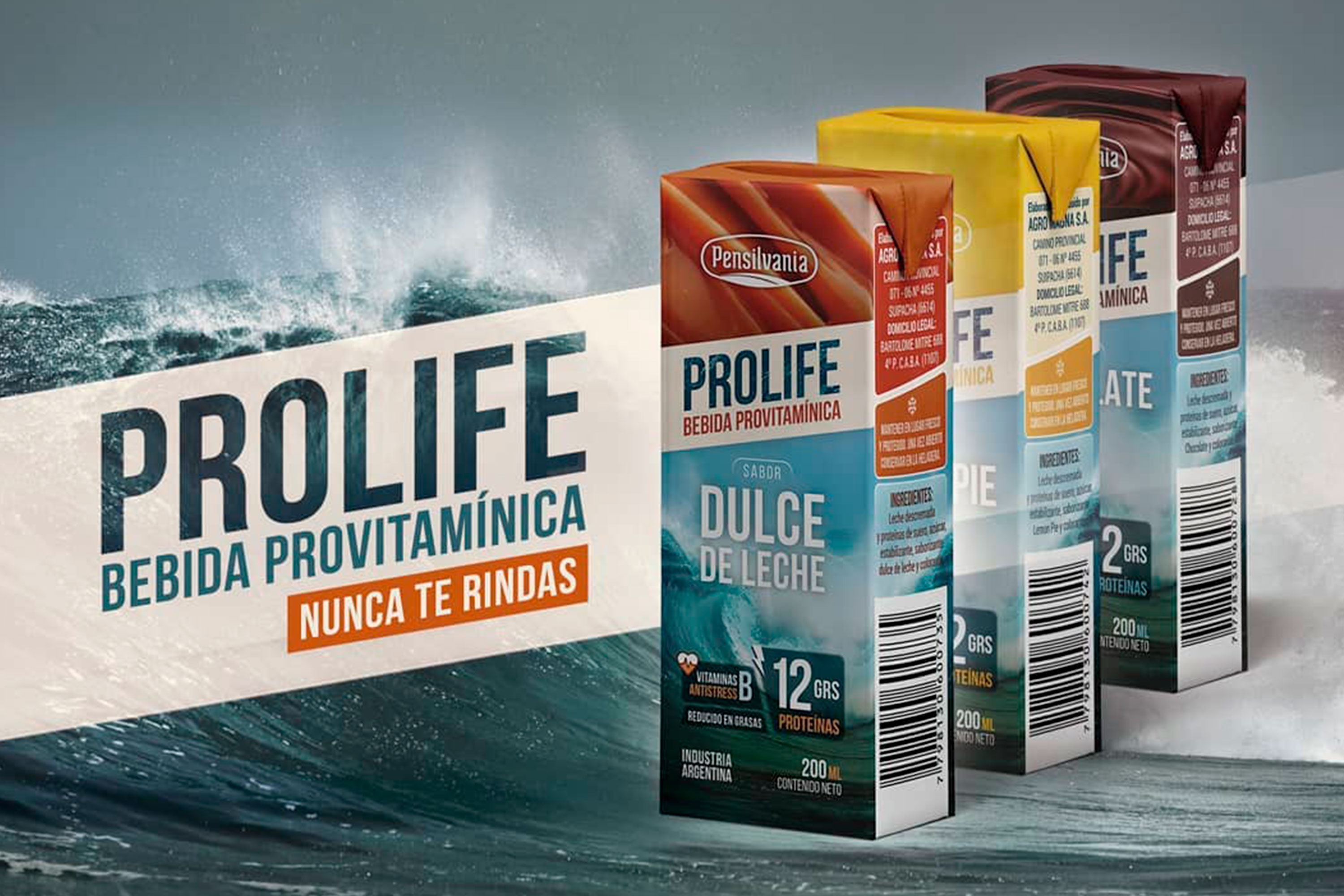
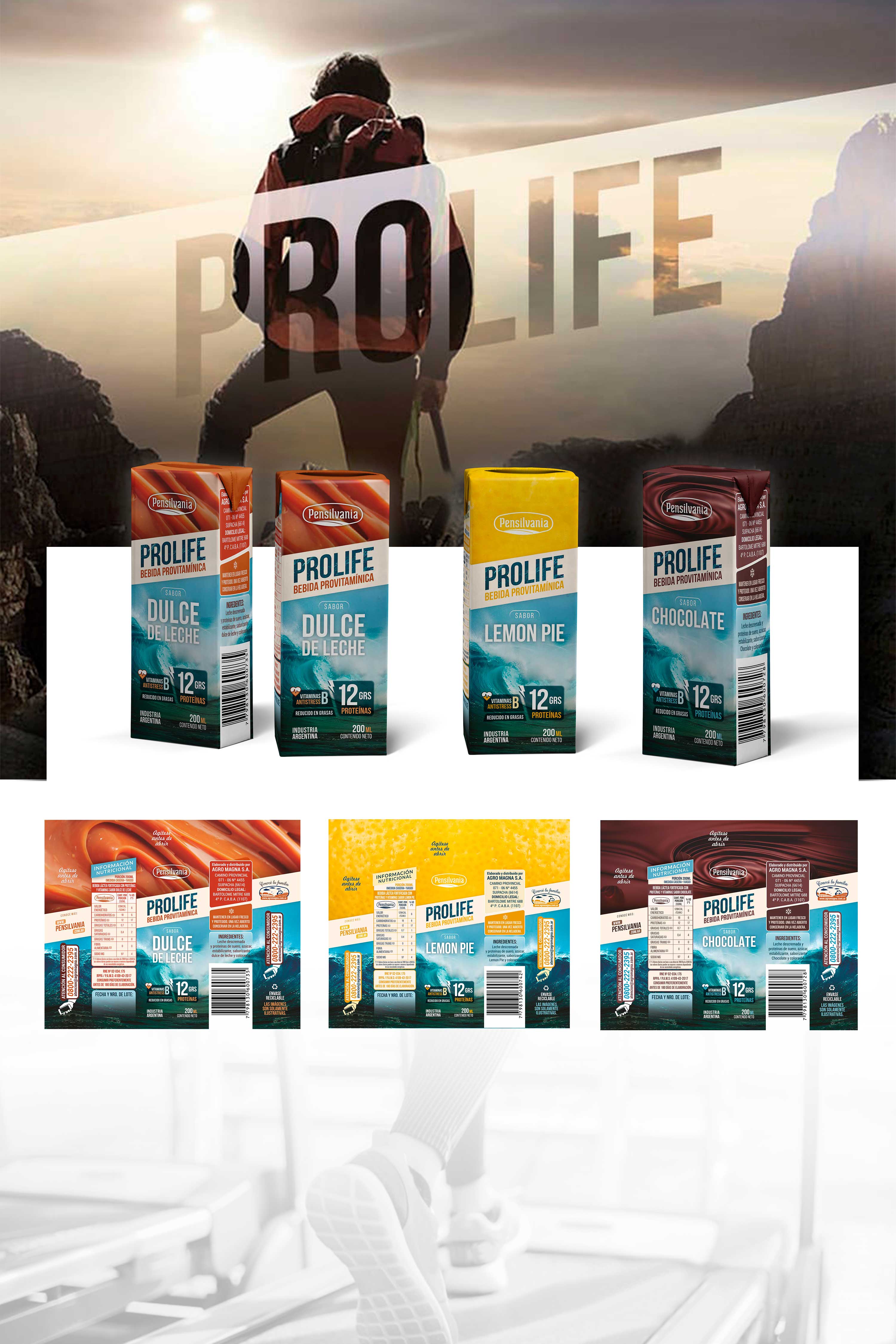
The company Agromagna S.A. bets to launch a new line of vitamin products, a field little developed by leading brands in our country, for this reason they approached us to design their visual identity and packaging.
The company Agromagna S.A. bets to launch a new line of vitamin products, a field little developed by leading brands in our country, for this reason they approached us to design their visual identity and packaging. Strength, emotion, speed, are some of the concepts we used as inspiration at the time of projecting the visual identity of the new line. By using a heavy and condensed dry stick typeface, we achieved a simplistic and attractive legibility, generating the desired impact. A packaging designed to convey the same ideas, where the use of high-contrast images to represent the concepts described stands out. The wave, always imposing, powerful and uncontrollable, is the best way to represent the brand's identity concepts.
Animación 2.5D + Motion Graphics
As an initial test in the target market, we produced a 2.5D animation video combined with motion graphics, presenting the product and its advantages.